Making Capmint Design System
Crafting Capmint’s premium design system that empowers traders through clarity, speed, and a calm second-nature experience.
The Team
Senior Product Designer
Product Designer
Shruti Sharma
Vishal Kaul
About
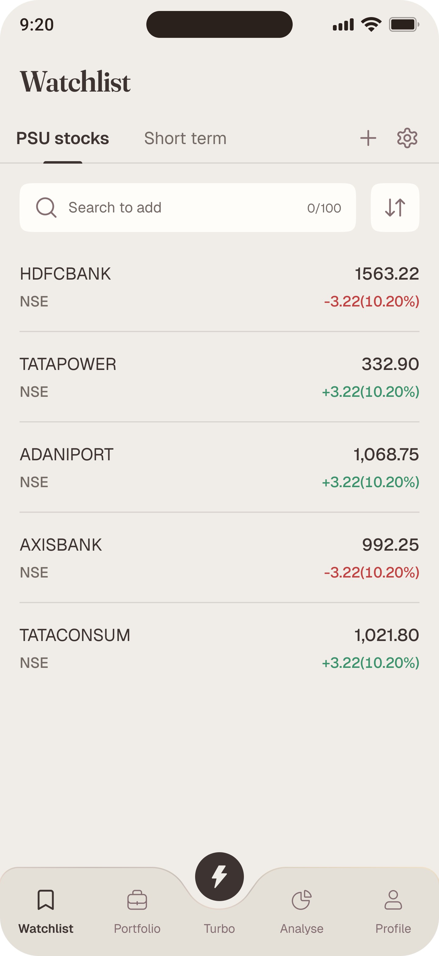
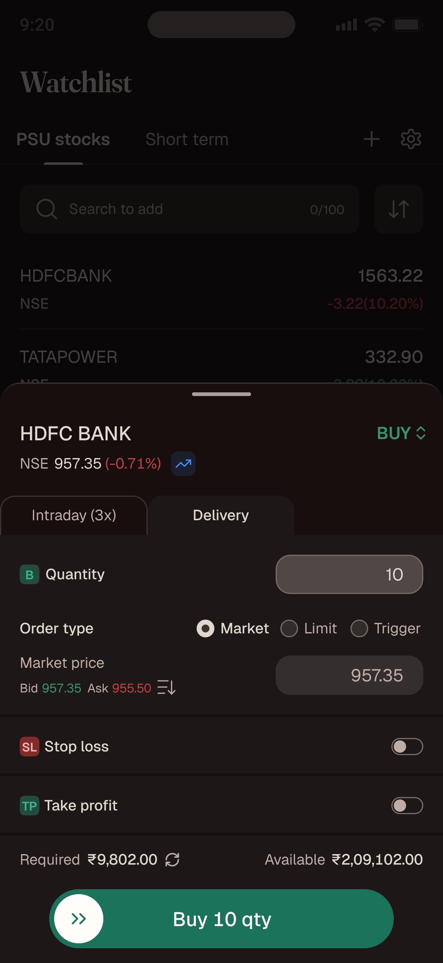
Capmint is a next-generation trading platform built for investors and active traders who want more than just transactions, they want clarity, speed, and trust in every decision.
Designed for both equity investing and Fn0 trading, Capmint combines powerful tools with a calm, premium interface that reduces friction and builds confidence in high-stakes markets.
The Challenge

1)Inconsistent visuals – corner radii, button hierarchy, icons, and illustrations lacked uniformity.
2)Cognitive overload – dense data with weak hierarchy made critical numbers compete for attention.
3)Not premium – colors, fonts, and tone didn’t convey trust or sophistication.
4)No design principles – lacked a unified philosophy to guide new features.
5)Font needs refinement to elevate brand perception
Understanding customers
Objective
To gather behavioral insights into how active traders track, interpret, and act on market data especially while managing multiple open positions in volatile F&O segments.
At Capmint, our goal was to understand how real traders think their mental shortcuts, emotional triggers, and behaviors while navigating the Option Chain and trading sessions.
I conducted 12 telephonic interviews to uncover trading habits, pain points, and decision patterns, and 4 shadow sessions with our co-founders both active high-frequency traders to observe real-time behaviors and entry–exit decisions during market volatility.
Scalpers / Pro Traders
100-200 trades/day
Precision + rapid order changes
Demand minimal UI, instant actions
Too many fields, mis-taps,
Slow multi-leg creation
Intraday Traders
20-50 trades/day
Clarity & P&L transparency
Cluttered data & confusing labels
Beginner Traders
1-5 trades/day
Simplified guidance
Overwhelmed by charts & jargon

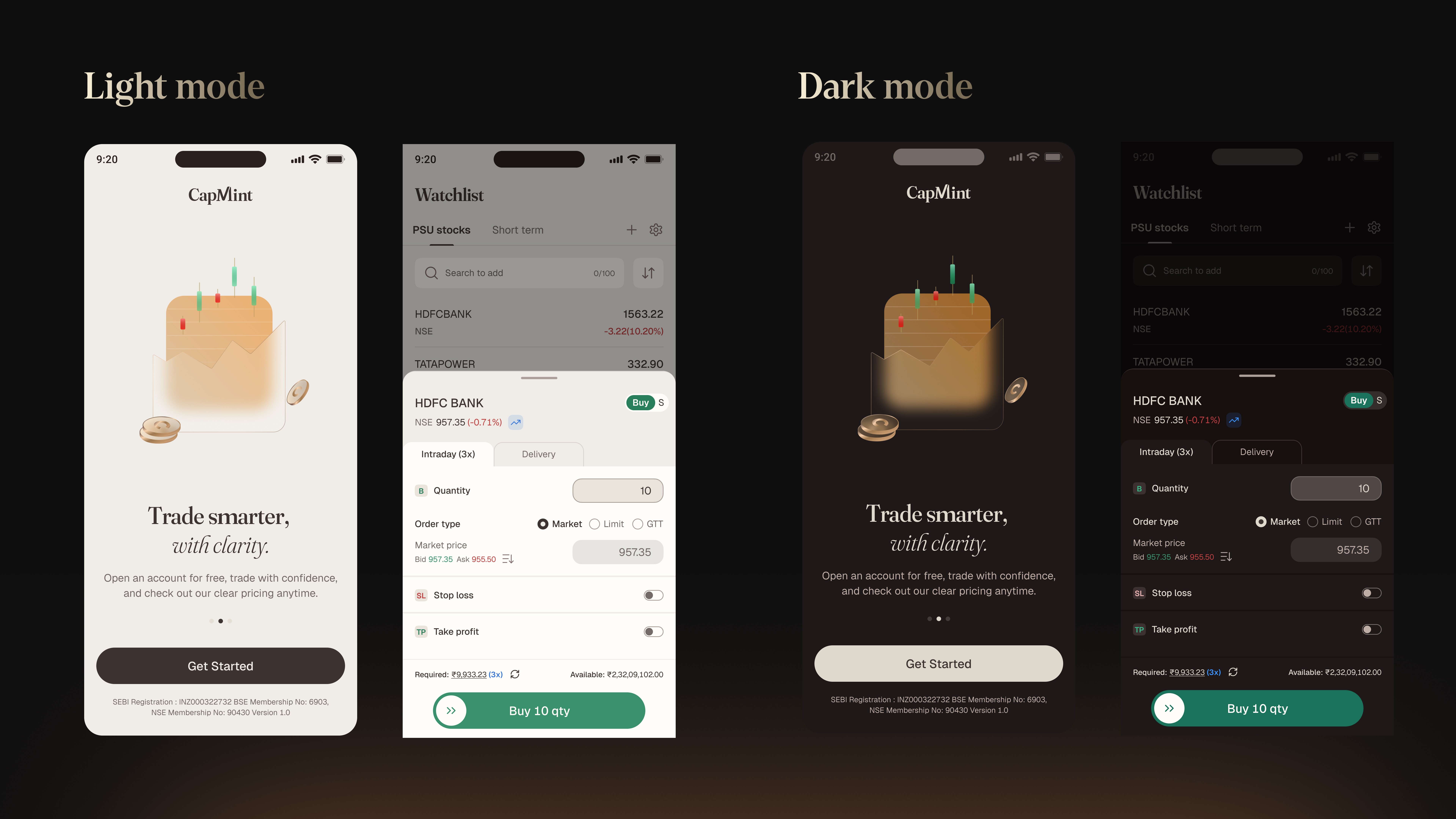
Design Vision
Premium, frictionless experiences that build trust through clarity, speed, and elegance with intuitive flows, delightful moments, and a calm, second-nature interface.
Design Principles

Moodboard

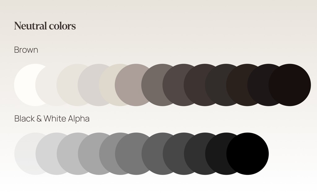
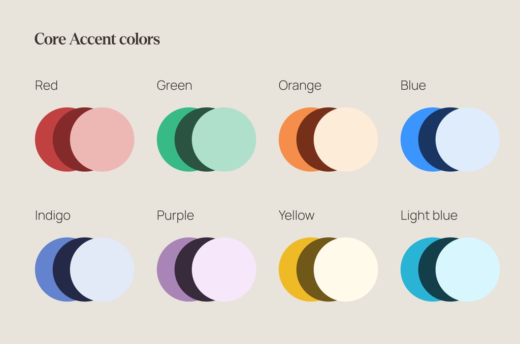
Expanding the color library

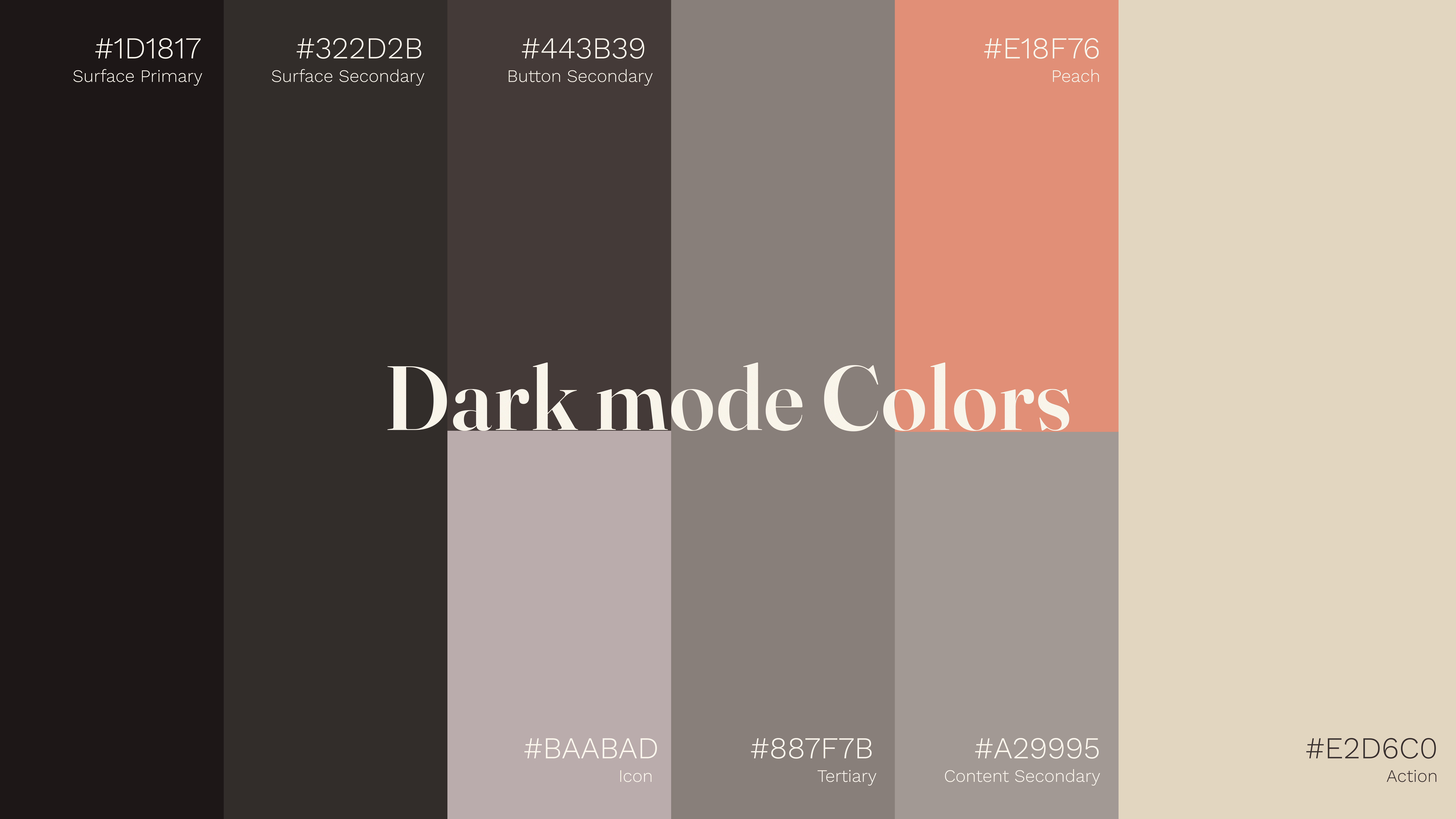
Primitive tokens
We began with a single core library containing nothing but primitives: raw values for colors, typography, and spacing. Since nothing like this had been done before at Capmint, it was more than just a technical setup it was a chance to audit and rationalize every value that had crept into our products over time.
Primitive color tokens became the base pigments of our system. They are not tied to meaning yet only to their hex value and tonal role. Think of them as the “paint tubes” in an artist’s studio before any canvas is touched.
By defining primitives at this level, we created a clean, reusable foundation. Instead of designers inventing new shades on the fly, or developers hardcoding colors, everyone draws from the same shared, atomic palette. Only when mapped into semantic tokens do they gain purpose.
Semantic tokens
If primitive tokens are our paint tubes, semantic tokens are the brushstrokes that bring meaning to the canvas. They transform raw values into purposeful roles that designers and developers can confidently use without debating hex codes.
When we defined our semantic color system at Capmint, the goal was simple: make every color choice intentional, predictable, and reusable. Instead of saying “use #FF6B6B here,” we say “use color.content.negative.” The intent becomes self-explanatory.
Typography That Balances with Clarity

Primitive and Semantic tokens
Typography carries the voice of our product. In a trading app, clarity isn’t just about aesthetics it’s about reducing cognitive load when users are reading fast-changing numbers, scanning tables, or making split-second decisions. Just like colors, we built our typography system around primitives and semantics.
We began with a core library of number-based primitives for type. These are the atomic building blocks: they don’t dictate meaning yet, they simply define values.
Consistency at Scale → Every text element follows the same rules across flows.
Responsive by Default → Each semantic token is defined for mobile, tablet, and desktop.
Faster Collaboration → Designers speak in roles (“Heading L”), developers use variables — no translation gap.
Future-Proof → If accessibility standards shift, we update a token once and the entire product adapts.
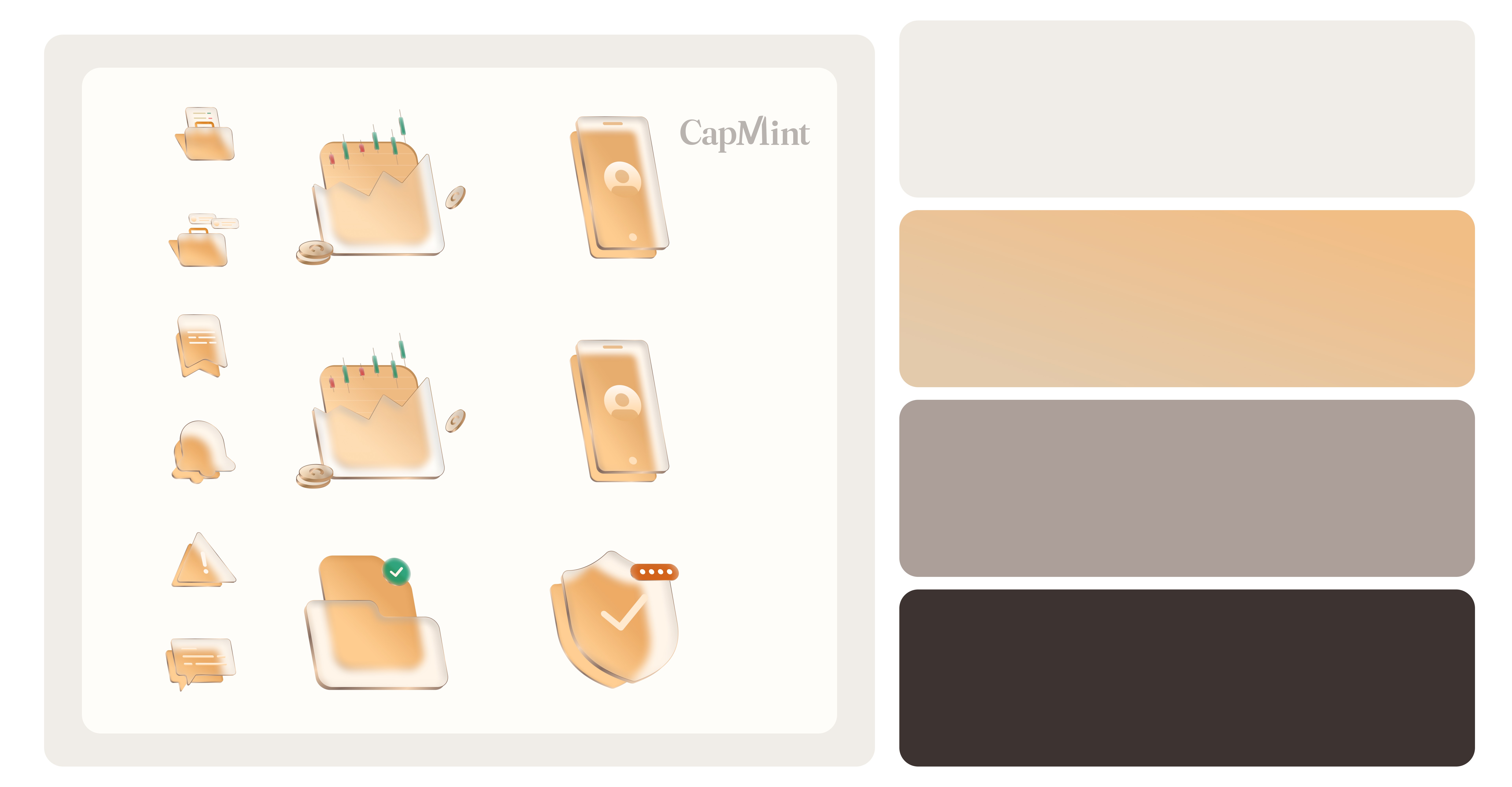
Exploring different illustration styles


Final Illustrations